

Color Longevity and Intensity
Home » Uncategorized » Color Longevity and Intensity
Lightfastness
The degree of lightfastness reflects how much a coloring agent is affected by ultraviolet light. UV light is present in both natural daylight and artificial light, and it breaks down pigments, causing colors to fade. The time it takes for this to happen depends on the stability of the dye and the amount of ultraviolet light it is exposed to. Some paints fade after just a few days; others may remain unchanged for years. There are various ways to measure this resilience.
Measurement according to the blue scale
Until 20–25 years ago, lightfastness was measured using the blue scale, consisting of 8 blue samples of woolen fabric. Each piece of fabric is dyed with a different type of blue dye, fixed in its fibers: lightfastness ranges from 1 (very low) to 8 (highest). Part of the blue scale and the colors being tested in parallel are covered, while the rest is exposed to highly concentrated artificial light until the first level has completely faded. Each subsequent section undergoes an increasingly smaller change in color, and No. 8—almost none at all. The degree of fading for each tested color is compared to the 8 levels on the scale, and the corresponding number is determined. If a color has a lightfastness rating of 7 or 8, this means that it will not fade, or will change only slightly, over a period of 100 years or more under museum conditions.
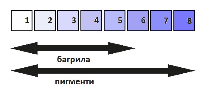
However, the comparison between the tested colors and the degrees of fading is carried out by a panel of 3 to 5 people and is therefore subjective. Furthermore, different manufacturers of paints, especially in Europe, use different symbols to indicate lightfastness, which often leads to confusion. . In order to provide an objective assessment and a clear classification, a scientifically based measurement method has been developed: D4304, established by the American Society for Testing and Materials (ASTM).
Measurement in accordance with ASTM D4304
According to this standard, the color being tested is exposed to a specified amount of artificial light—either in its pure form or pre-mixed with white or water (for watercolor)—until it reaches a specific level of reflectance. The color with the lowest lightfastness, in its pure or diluted form, is used as a basis for comparison. Exposure to the amount of artificial light specified by the standard is usually described as “museum conditions.”
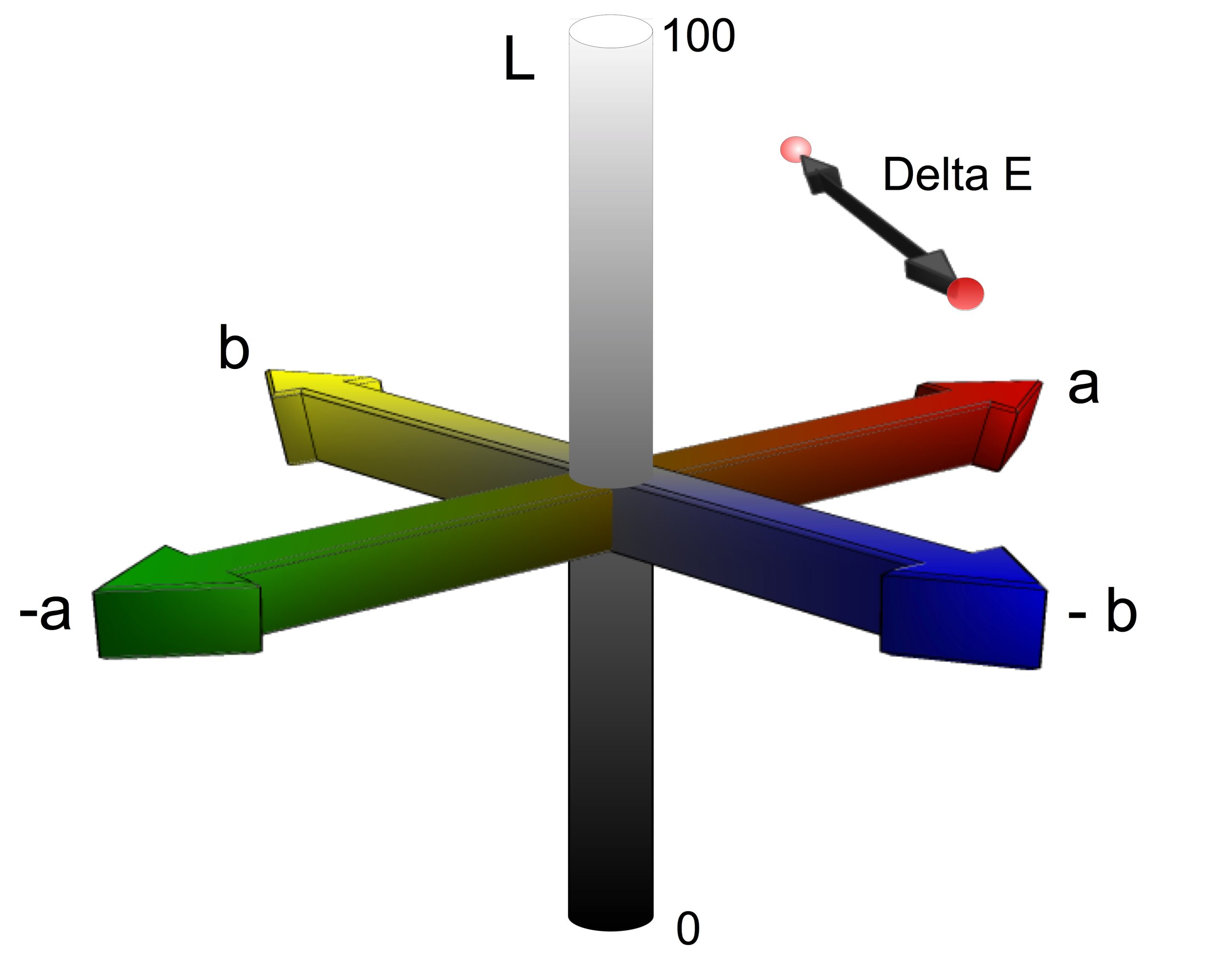
Colors are measured before and after illumination using the CIE-L*a*b* method. CIE is the French abbreviation for the International Commission on Illumination, and L*a*b* is an internationally recognized method for measuring colors.
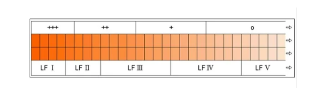
L* corresponds to the position on the gray axis, a* to the green-red axis, and b* to the blue-yellow axis. The change in color, ∆E*, is calculated using the formula ∆E* = √ (∆L*)² + (∆a*)² + (∆b*)², the result of which determines the color classification. If ∆E* is less than 4, the color has excellent lightfastness and belongs to the LF I group (LF stands for lightfastness). LF II ranges from 4 to 8, LF III from 8 to 16, and so on.
Symbols of Sustainability
- o = < 5 low lightfastness; the color lasts up to 10 years
- + = 5–6: moderate lightfastness (10–25 years)
- ++ = 6–7, good lightfastness (25–100 years)
- +++ = 7–8: excellent lightfastness (at least 100 years)
All designations refer to lightfastness under museum conditions.
Coverage
The second characteristic of colors is their opacity, or coverage, which also depends on the pigments. These range from very transparent to very opaque, and these variations are visible only if the paint does not contain fillers, that would make it more opaque. The difference in the opacity of the paints is measured at the same layer thickness.
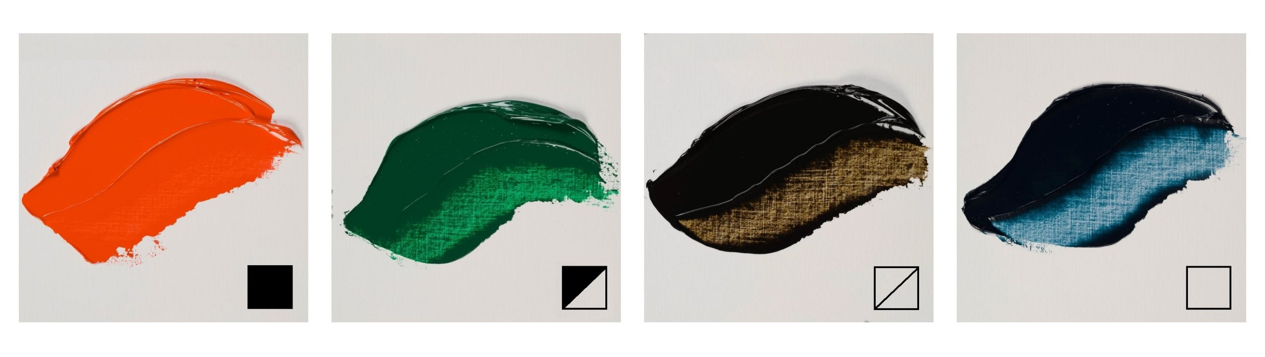
Royal Talens paints are divided into 4 categories:
- ☐ transparent
- ⧄ translucent (more transparent than opaque)
- ◩ semi-opaque (more opaque than transparent)
- ■ Opaque (completely non-transparent)
These symbols are not used for gouache and watercolors. Gouache By definition, it must be opaque, which is why a filler is added to it. As for watercolor, although most paints are made as transparent as possible—since that is the medium’s primary quality—the series Rembrandt and Van Gogh also use more opaque, even completely opaque colors. The effect that pigments have on the transparency of paint is also evident in transparent media, such as watercolor.
Translation from Royal Talens’ Artists’ Materials Manual (2020): Martina Petrova


