

Painting on Black Paper | With a Focus on Watercolor
Home » Uncategorized » Painting on Black Paper | With a Focus on Watercolor
The trends that have taken off over the past two years pearlescent, metallic, and iridescent and, generally speaking, shiny and light-reflecting art supplies have created the need for a rich, dark background against which they can stand out— such as watercolor sketchbooks with black paper.
Of course, there has always been black cardstock suitable for dry media or craft projects. Only now, however, have black gelatin-coated papers made from high-quality cellulose and even cotton been developed, which are just as good and durable as traditional watercolor paper. This gives us the peace of mind and freedom to work liberally with water, to rewet the colors, and to “lift” them. lifting) without worrying that the sheet will warp or become worn out.
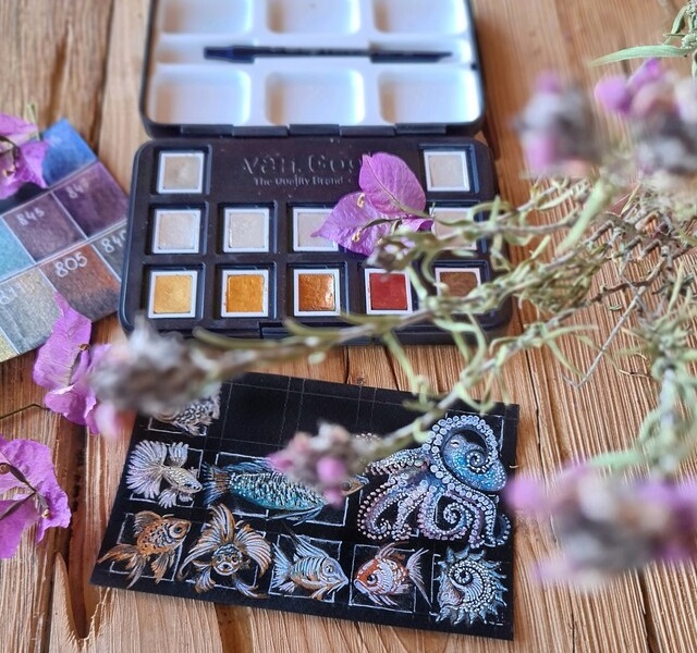

How do you draw on black paper?
Drawing on black paper is a mental exercise: instead of building up the shadows in the picture and leaving white spaces for the lit areas, we actually build the image by adding light tones. In other words , we work from dark to light.
In practice We can call black paper the darkest of the tinted papers. Like the others, it makes it easier and faster to finish a painting, since we only need to add half of the light-and-shadow spectrum. Consequently , black paper is a very practical solution when shadows or dark colors dominate the scene we want to depict.
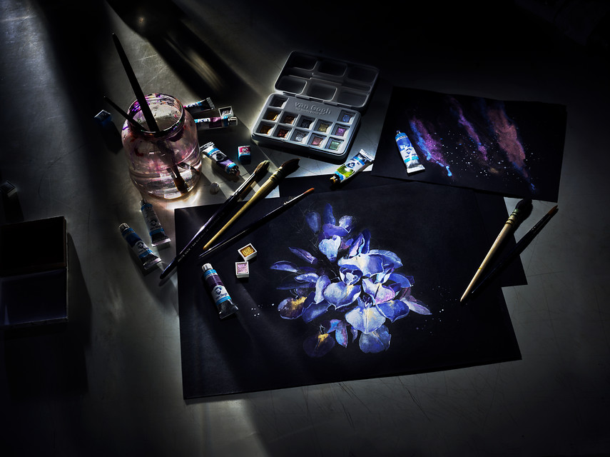
To make them visible on black paper, transparent watercolors can be applied more generously, with less water or a little white watercolor. In fact, in the traditional approach to watercolor—which is characterized precisely by its ethereality and transparency—solid white is used only for highlights and reflections. To “add” white to the painting, we simply leave parts of the paper unpainted from the very beginning. Although this deviates from standard practice, incorporating white paint still conveys the beauty of the medium and opens up many opportunities for experimentation.
The Interesting Effect of Black Paper
Light colors stand out sharply against the black background and appear more saturated and vivid because that is how the eye perceives them. Keep in mind, however, that the black paper showing through from underneath visually darkens the shades, so they should be intentionally applied lighter.
Even if we cover our sketches completely with color (for example, if we’re painting with an opaque medium like gouache), Black, unpainted streaks often remain. They give the paintings a unique pattern, similar to linocut printing.
Adding black details to a nearly finished painting is also striking. In this case, black can also be used for corrections—an advantage over light-colored drawing paper.
The Vibrant Colors
Some watercolors are naturally less opaque than others; this is typically the case with the more saturated metallic colors.
But what is the difference between metallic, pearlescent, and iridescent/interferential shades (from the English iridescent and interference colors)?
To be honest, in everyday speech they are widely used as interchangeable synonyms for a color with a pearlescent sheen. If we were to distinguish between them, it would be as follows:
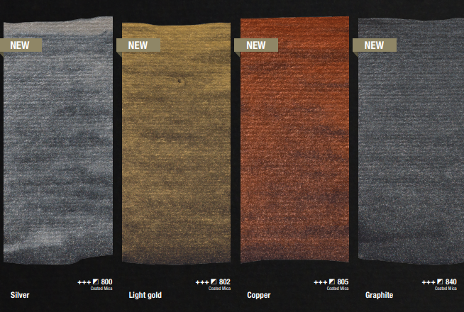
- metallic — since metallic paints are made from mica pigments (very fine pearlescent mineral powders), they actually produce a pearlescent sheen rather than the clear mirror-like reflection characteristic of metals. Chrome paints and sprays are the exception. In other words, we can say that metallic paints are a type of pearlescent paint, but in typical metallic shades—gold, copper, silver, platinum, and so on.
- pearlescent —all other colors not typical of metals, with a single-color pearlescent sheen. Pearlescent paints are different from glitter paints, which contain larger brocade particles.
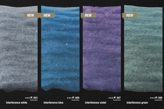
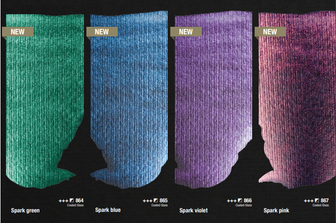
- iridescent — transparent, glossy paints with two-color, three-color, or multicolored light reflection. This is due to the optical phenomenon of iridescence, which results from the interference and diffraction of light. We have observed the same phenomena in multicolored soap bubbles, the wings of birds and insects, mussel shells, minerals, and other objects. Completely transparent, iridescent colors They stand out once they dry and are viewed from a different angle. They become more visible on dark backgrounds or when mixed with a dark color, as the different surface or added paint alters their dominant hue.
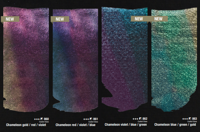
Often, bright colors are more striking when used only as accents rather than dominating the picture, in the spirit of ““less is more.”
A closer look at Rembrandt’s special series of pearlescent watercolors.
Sketching on black paper
Most hard pencils leave visible marks when rubbed against black paper. To avoid having to erase too early, we can transfer our sketch instead of drawing directly on the sheet. To do this, color a sheet of paper with a light-colored dry pastel, chalk, or pencil, then turn it over, place the sketch on top, and trace it. This produces precise, error-free outlines, which we can then lighten with a bread eraser.
Author: Martina Petrova


