

White Inks and Their Uses
Home » Uncategorized » White Inks and Their Uses
Key Characteristics of White Inks
Coverage
The opacity of white ink is determined by how well it covers black or tinted paper, as well as other inks. KThe characteristics of an ink are typically classified as high, medium, or low opacity. However, transparency—or the lack thereof—is not an indicator of the overall quality of a particular brand. white ink.
Some white inks are specifically formulated with low opacity, which makes it possible to work with halftones when building the overall plasticity of a given form. Examples of such inks include watercolor inks, whose unique flow and blending properties allow artists to achieve the expressive quality characteristic of watercolor painting. While the colored inks in the watercolor series are barely visible on dark backgrounds, white ink stands out well on black paper.
Density
Better coverage, in turn, often affects viscosity. This characteristic determines the ink’s thickness and the way it leaves marks on the paper. Classic ink drawing with various types of pens, for example, requires a thin liquid that flows easily down the nib while leaving solid, non-bleeding lines on the paper. Thicker inks, which usually also have higher opacity, are convenient for working with a brush, for adding contrasting details or making corrections.
Reactivity
It is precisely during the correction process that the third key characteristic of white ink becomes apparent —its reactivity when mixed with other inks and ink sticks. For corrections or layered drawing, it is important that the ink has high opacity and, at the same time, low reactivity. Very often, when working on a painting that has already dried, a change in the color of the treated area or a loss of color may occur. This reaction results from the interaction of the white pigment with the pigments and dyes in the other paints or inks used.
This characteristic is also crucial when working with colored inks, especially watercolors. With these inks, where the image is created by blending colors on a wet surface, adding white ink can cause the finished image to blur further, as well as the so-called “bleeding” (from the English bleeding).
When mixing the inks to produce a mixed color the low reactivity of white ink once again plays a key role. Unless, of course, we are aiming to achieve the metallic blue color, which is the most common result of the chemical reaction between the white pigment and other inks and dyes.
Archival Status
The archival quality of white ink depends primarily on its resistance to water and light. The pigments used in a composition exhibited in a gallery setting, where light is of paramount importance, should be resistant to fading. Light-sensitive pigments change in intensity and contrast over time, which can lead to a gradual change in the colors of a painting. This phenomenon is also observed in some white pigments.
Humidity is also a determining factor for water-sensitive inks, even after they have completely dried. Inks with this sensitivity are most commonly used in illustration and graphic design, where the drawing serves as the basis for a project. In illustration, the finished compositions are transferred to a digital format, which forms the basis of modern printed books. Such projects can be stored in a dark, dry environment that will not affect the intensity and contrast of the inks.
The approach to working on a given image and the goals that have been set are what guide the choice of one white ink over another. While the overall qualities of a white ink might be suitable for brush illustration, for example, they would be difficult to use for calligraphy.

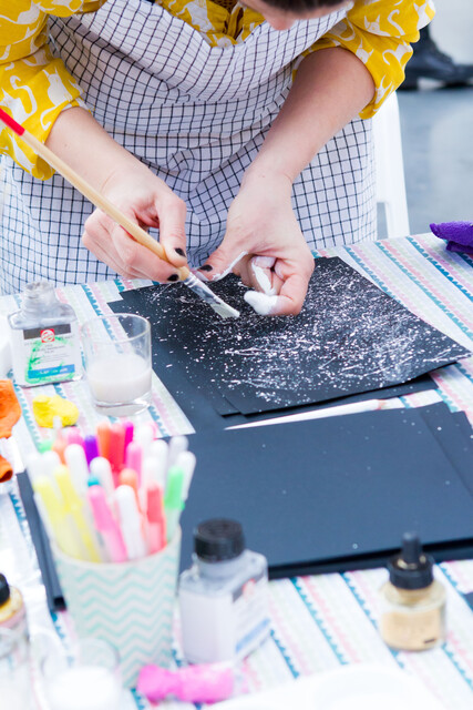
For working with a pen
For the classic ink drawing ink and pen , there are several well-established brands of white ink on the market:
One of them is Daler Rowney FW acrylic ink. The pigments mixed with the acrylic base of this white ink are responsible for its extremely high coverage, which, however, does not affect its viscosity. This acrylic ink flows wonderfully on all types of metal and bamboo nibs, leaving a thick and permanent line on the sheet (it is good that the paper is pre-selected for working with ink and pen). The ink also has low reactivity and high archival properties, which are the qualities sought in a white ink for the purposes of fine ink and pen drawing.
Talens Amsterdam White Acrylic Ink is a very similar product, also formulated with an acrylic base, whose pigments are known for their high opacity. Its rich color does not affect its thickness. Its low viscosity makes it exceptionally easy to work with using a brush or pen. It has high lightfastness, making it suitable for display in a gallery, and once dry on paper, it also stands out for its high water resistance.
Another ink suitable for this type of art is Speedball Pigmented Acrylic Calligraphy Ink. As its name suggests, this white acrylic ink is specially formulated for calligraphy, and as such, it is exceptionally pleasant to work with using any type of pen. It offers high opacity and high contrast on black and tinted paper. Its lightfastness makes it suitable for both traditional drawings and display in a gallery setting.
Pigmented white watercolor-based white inks They also have their advantages when working with ink and pen on black paper. Their opacity is significantly lower than that of acrylics, but their viscosity is exceptionally well-suited for working with pens.
Two similar brands on the market are Talens’ Ecoline and Daler Rowney’s Aquafine Watercolor Ink, suitable for rendering halftones or for building up the three-dimensionality of a form through gradual layering.
You can read more about drawing and writing in white, as well as ideas for working on different surfaces, here.
Author: Zlatka Yaromova


