

No products in the cart.
Your order
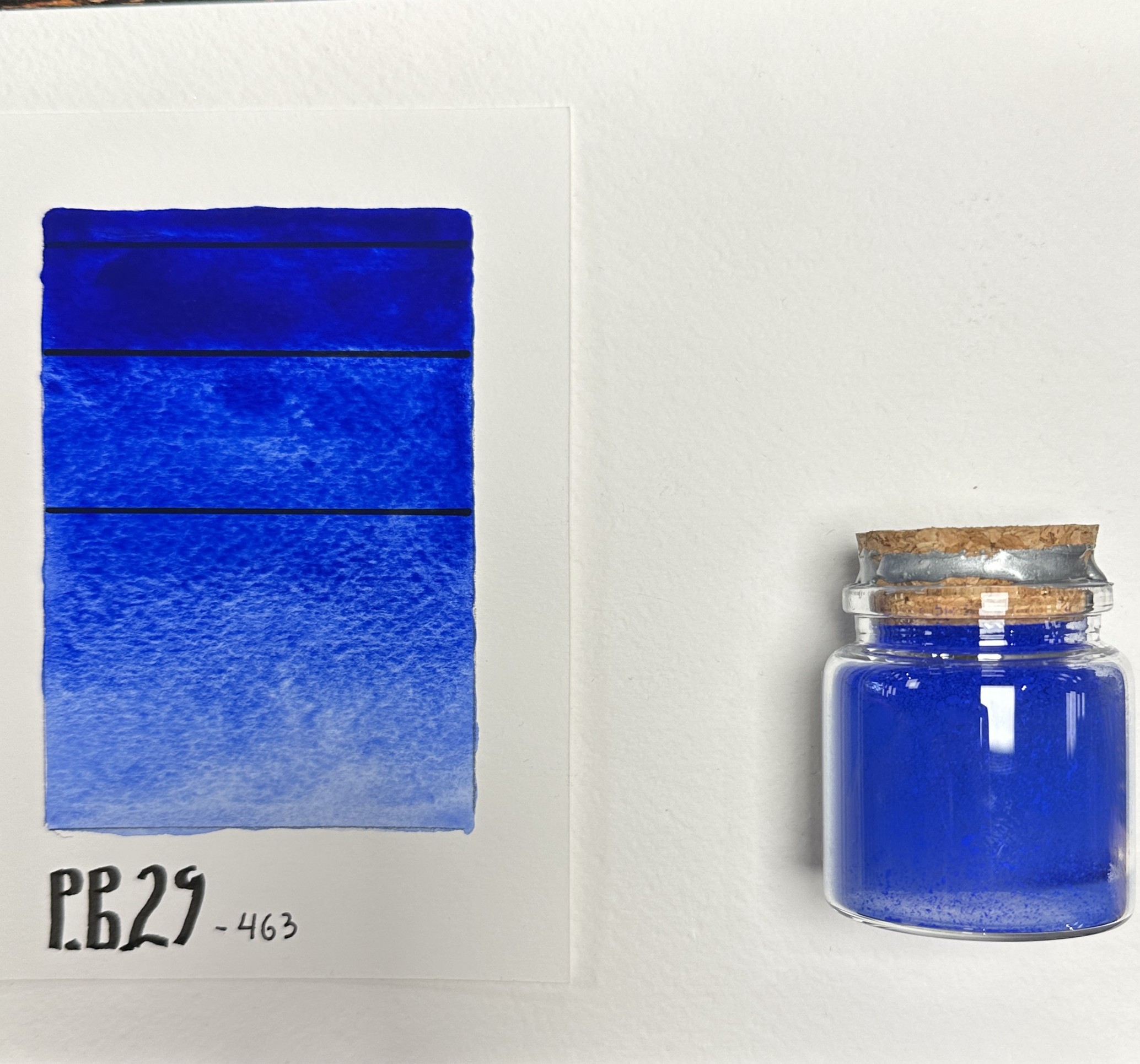
Powder Pigment: Ultramarine Blue: PB29: 10 g
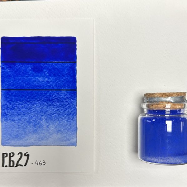
Powder Pigment: Ultramarine Blue: PB29: 10 g
2.50 €
2.08 € (excl. VAT)
PB29 (Pigment Blue 29), with product code 463, is a synthetic inorganic pigment with a complex silicate structure (sodium aluminum sulfosilicate).
It is characterized by a specific three-dimensional crystal lattice that captures light and gives the pigment its distinctive deep, warm blue color with a pronounced violet undertone.
It has very good translucency.
Packaging: 10-gram glass jar.
Packaging: 1 kilogram.

Check Availability
Product is available in stores only. Check Availability
Product is out of stock.
Rate Product
Key Technical Specifications:
Color Index: PB29 (77007)
Chemical composition: Sodium-aluminum silicate containing sulfur (Na₆₋₈Al₆Si₆O₂₄S₂₋₄)
Lightfastness: Excellent (grade 8 out of 8 on the blue wool standard scale*). The pigment is completely resistant to UV rays and retains its intensity for centuries.
Alkali resistance: Fully resistant to lime, cement, and strongly alkaline environments.
Sensitivity to acids: An important detail! The pigment is sensitive to acids (even weak acid rain or acidic conditions in certain environments can cause discoloration and the release of hydrogen sulfide). It is not recommended for highly aggressive exterior coatings in industrial areas.
Dispersibility: It exhibits good hydrophilic properties. It mixes and wets with water and water-soluble media significantly more easily than organic blue pigments, without requiring excessive amounts of wetting agents.
Ultramarine is compatible with most binding agents, provided they are not acidic:
Painting (Oil, Acrylic, Tempera, Watercolor): One of the most important pigments for depicting a deep sky, shadows, and atmosphere. Due to its translucency, it is valuable for glazes and veils. When applied in a thin layer, it allows light to pass through, creating an optical effect.
Color Mixing: Thanks to its natural violet undertone, PB29 is the best choice for mixing with red pigments (such as carmine or magenta) to produce pure, saturated violet and lilac tones. When mixed with yellow, however, it produces duller, olive-green shades (unlike PB15).
Construction, Mosaics, and Frescoes: Historically, this has been the primary blue pigment used in fresco painting (painting on wet lime plaster) due to its excellent alkali resistance. Suitable for coloring interior plaster, gypsum, cement, and grout.
Epoxy resins: Due to their medium opacity, they allow you to achieve a beautiful “aquamarine” or deep ocean effect in transparent layers of resin.
Comparison with Phthalocyanine Blue (PB15):
Nuance: Ultramarine (PB29) is a “warm” blue with a violet tint, while phthalocyanine blue is a “cool” blue with a greenish (cyan) undertone.
Opacity: PB29 is less opaque and more translucent than the intense PB15, making it easier to control when creating subtle transitions and shading.
*Note regarding lightfastness: The Blue Wool Scale is the international laboratory standard for measuring the lightfastness of dyes. It consists of 8 grades, with Grade 1 indicating minimal resistance and Grade 8 indicating maximum resistance to UV rays and complete protection against fading over time.
Additional information
| Weight | 0.0150 kg |
|---|
We dispatch 98.5% of orders received by 1pm on a weekday (Monday to Friday) same day , for collection from a courier office or delivery to an address in major cities on the next working day.
Phone numbers for contacting our online order fulfillment center in the Industrial Zone of the City of Varna:
0898 608 004 and 0878 131 023on working days from 8.00 to 17.00hours.
Confirmation of receipt of the order and changes in its status arrives automatically to the e-mail specified in the order. We call only if additional clarifications are necessary or an imposed delay.
Shipping Rates
Orders for an amount over BGN 100 have free delivery to the address or office of the courier.
For orders worth less than BGN 100, the cost of the courier service is at the buyer’s expense and is determined depending on:
- The selected courier company Speedy AD or Econt Express
- Delivery method (To office or to address)
- The weight and volume of the shipment
The amount of the courier service is calculated automatically by the system upon completion of an order.
A minimal difference in the amount of the courier service upon receipt of the package is possible due to discrepancies in the total weight of the package calculated by the system and the weight measured by the courier company.
Customers of the Slanchogled online store enjoy a 30% discount from the basic tariff for courier services of Econt Express OOD and preferential prices upon delivery by Speedy AD courier.
Payment method
- Cash to the courier upon receipt of the delivery (cash on delivery)
- By bank transfer
- Pay by card
Delivery Method
- To the specified office or address by courier of Speedy AD
- To the indicated office or address with Econt Express courier
Return of goods
- Return of goods for a full refund is accepted within 14 days, subject to the conditions specified in the Consumer Protection Act
- If a defect is detected or an item sent incorrectly, Slanchogled bears the courier costs for returning the item
- In case you want to return the goods for another reason – courier costs are covered by the recipient
For inquiries and questions
You must be logged in to post a review.



Reviews
There are no reviews yet.